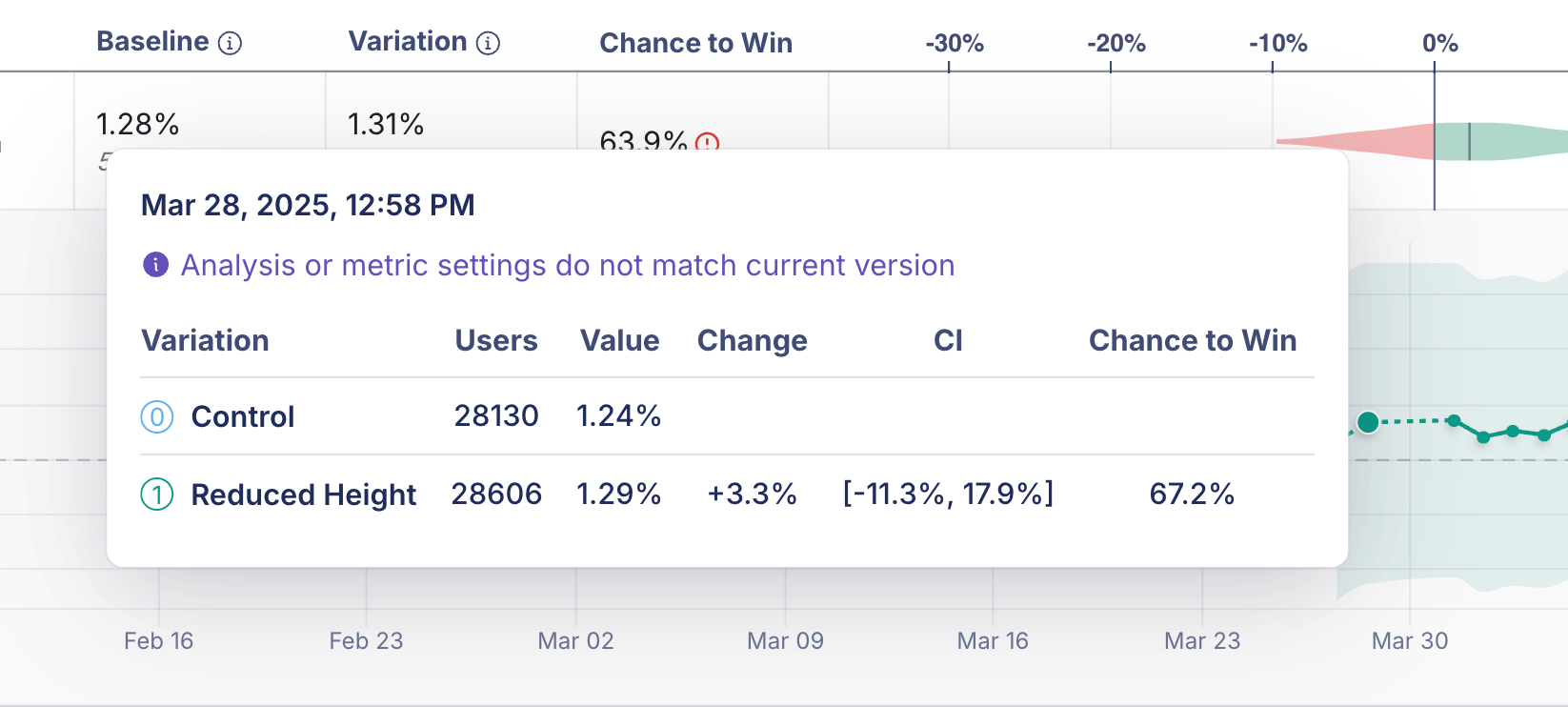

The time series chart shows the cumulative results of your experiment. It’s accessible from the Metric Drilldown available from the experiment results view. Click on the row for the metric whose time series you want to see. Each data point represents cumulative results for that day. When there are multiple updates within a day, GrowthBook consolidates them into a single daily point to keep the chart easy to read.Documentation Index
Fetch the complete documentation index at: https://growthbook-preview.mintlify.app/llms.txt
Use this file to discover all available pages before exploring further.
FAQ
Why is some part of the time series dotted?
A dotted line in the time series indicates a period when metric settings or analysis settings were different from the current settings or results. Because older data may not be directly comparable, the dotted line shows historical results where comparability is less certain. (A solid line line indicates results that are immediately comparable.)