

Documentation Index
Fetch the complete documentation index at: https://growthbook-preview.mintlify.app/llms.txt
Use this file to discover all available pages before exploring further.
Leaderboard
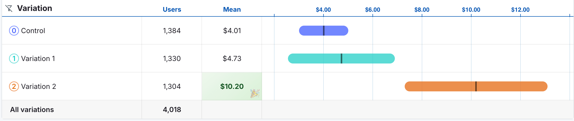
The leaderboard is the best tool for comparing variations with respect to the decision metric. In the example below, the decision metric is revenue.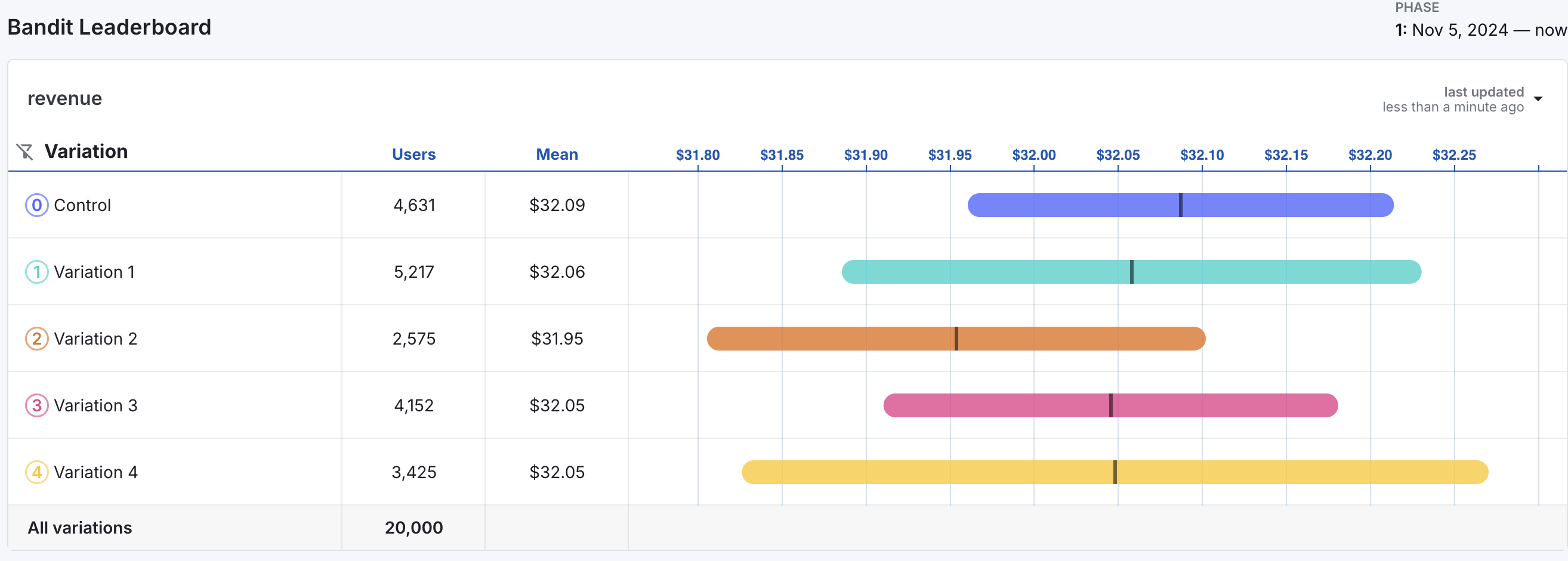
- The Users column on the leaderboard indicates the number of users per variation in the experiment. Note that the number of users is vastly unequal across variations, indicating that the bandit has been favoring some variations over others.
- The Mean displays the variation mean for the decision metric.
- The chart to the right of the columns displays credible intervals for mean revenue for each metric.
- The black vertical lines indicate the estimated mean revenue for each variation and are equal to the values in the Mean column.
- The colored bands around the black lines represent 95% credible intervals for mean revenue by variation.
Graphs of Performance Over Time
Below the leaderboard are 3 different time series graphs to help you understand how the bandit evolved over time.Cumulative Variation Means
The first graph shows the cumulative means of the decision metric over time.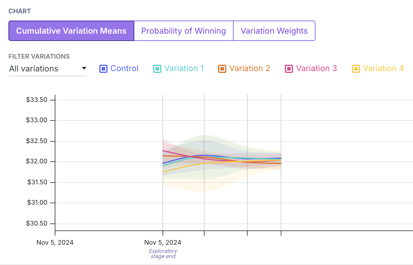
Probability of Winning
The second graph shows how the probability of each variation being the best changes over time.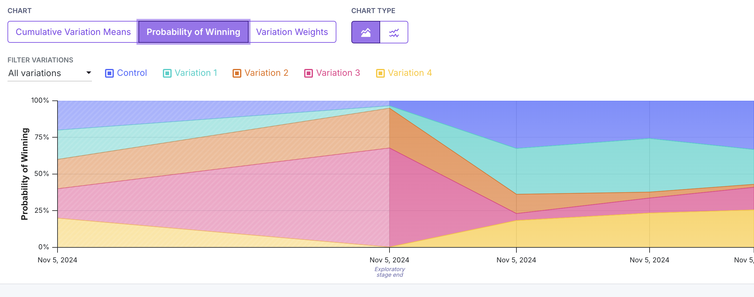
At the beginning of the experiment during the exploration phase, each variation had an equal chance of being the best. After the exploration phase, Variation 3 (in red) had the highest probability of being the best, and received the most traffic.
Control and Variation 2 also had high probabilities of being the best, but received less traffic. Variations 1 and 4 had low probabilities of being the best and received the least traffic.
Variation Weights
The third graph shows the variation weights over time.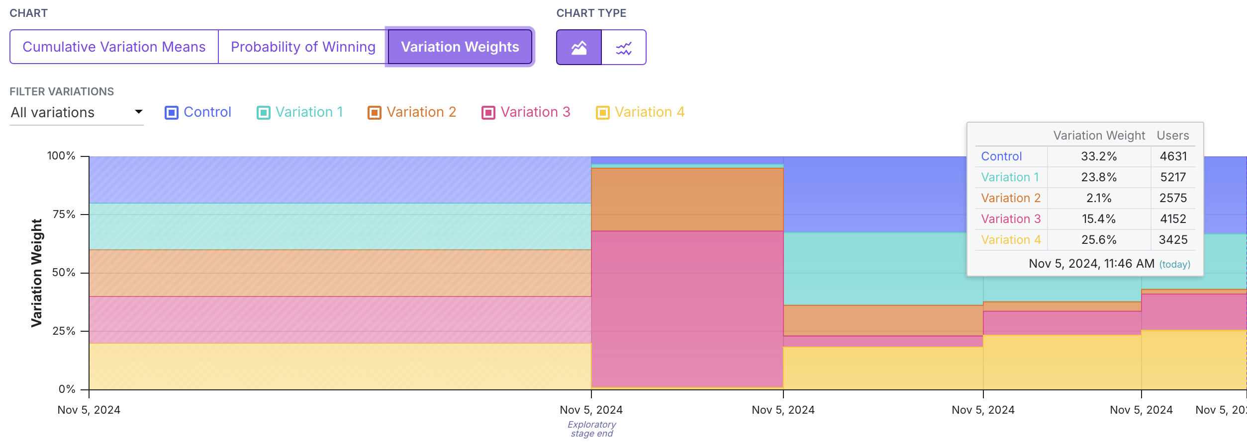
This tooltip also works for the probability of winning graph.
Explore Tab
While bandits suffer from biased results, it may sometimes be of interest to look at differences in variations, as in a standard experiment. The explore tab shows standard experiment results for the decision metric and for any secondary or guardrail metrics. Results on the explore tab are interpreted in the same way as in a standard experiment. Again, we caution that these results may be biased, and should be interpreted with caution.Debugging Issues
Sticky bucketing is a feature that ensures that users are consistently assigned to the same variation throughout the experiment. This is important for bandits, as it ensures that the same user is not assigned to different variations over time as the variation weights change. Sticky bucketing helps avoid multiple exposures, which can cause bias in the results as well as inconsistent user experiences. Evidence of multiple exposures likely indicates that your Sticky Bucketing is not set up at the same level as your randomization attribute for the Bandit. For more on this topic, see the section on correctly set up sticky bucketing.What can cause multiple exposures?
Imagine you are randomizing by a logged-in User ID. However, your sticky bucketing service is stored in a cookie. When the user first hits the bandit, we hash their User ID to a number from 0 to 1, and assign them the corresponding variation. We also store this in a cookie on the user’s device. A day passes and the bandit updates the variation weights. Now, when the User ID returns on their phone, they get the same hash value from 0 to 1, but because the variation weights have changed, that value maps to a different variation. Furthermore, because they are on their phone, they do not have access to the cookie where their sticky bucket is stored. Then, they will be assigned to a new variation on their phone, triggering a multiple exposures warning.FAQ
- Why does the leaderboard show a negative value for the CI for a proportion metric?
GrowthBook’s bandit uses solely a Gaussian Thompson sampling approach for both proportion and binomial metrics. This allows us to mitigate bias caused by conversion rates that change over time with a unified weighting approach. So you may see some negative values for proportion metrics, but they should normalize with increased sample size and if your conversion rates are less extreme (e.g. further from 0% and 100%). - How can I see the number of conversions by arm?
You can see the number of weighted conversions per arm on the Explore Tab. Because we apply a weighting approach to safe-guard the bandit against bias from changing conversion weights over time, the numerator used to compute means (either conversion rates for proportion metrics or just averages for mean metrics) is weighted over bandit update periods.